
Building Custom Leaflet Plugins: Creating a Scalable Legend and Layer Switcher
Introduction
Interactive web maps often start with Leaflet’s default controls for zooming, selecting layers, and displaying attribution. These controls provide a practical foundation, but enterprise Web GIS applications frequently require more specialized interfaces: categorized datasets, dynamic legends, grouped overlays, collapsible panels, and consistent styling across multiple maps.
Consider a municipal Web GIS displaying zoning boundaries, flood-risk areas, road networks, and population density. Users need to enable and disable individual datasets while immediately understanding the colours and symbols currently displayed on the map. A static legend quickly becomes inaccurate when layers change, while a separate layer switcher forces users to manage visibility and interpretation independently.
The solution is to build custom Leaflet plugins for a layer switcher and legend that share the same configuration and respond to changes in map state.
Leaflet’s L.Control class provides the foundation for this approach. A custom control implements onAdd() to create its interface and can implement onRemove() to release event listeners when removed from the map. Leaflet also provides map events such as overlayadd, overlayremove, and baselayerchange, which allow controls to stay synchronized with layer visibility.
This tutorial develops a reusable control targeting Leaflet 1.9.4, the stable release listed by the official Leaflet download page at the time of writing. Leaflet 2.0 remains a prerelease, with modernization changes that warrant separate compatibility testing.
By the end, you will have a modular JavaScript control with a collapsible interface, radio buttons for base maps, checkboxes for overlays, and a legend that updates whenever the active layers change.
1. Understand the Plugin Architecture
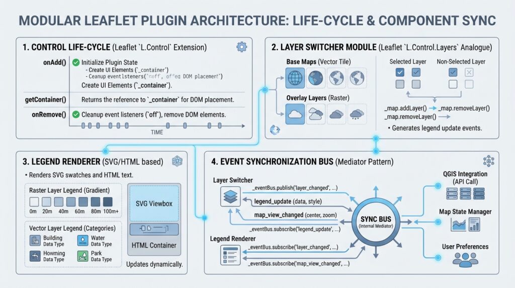
Before writing code, separate the control into four responsibilities.
| Component | Responsibility |
|---|---|
| Control class | Defines the plugin lifecycle and configuration |
| Layer switcher | Enables and disables base maps and overlays |
| Legend renderer | Displays symbols and labels for active layers |
| Event listeners | Synchronize the interface with map state |
This separation matters as a project grows. A small map might contain three layers, while a regional GIS application could contain dozens of datasets grouped by theme. A configuration-driven plugin avoids writing separate HTML and event handlers for every dataset.
The proposed control accepts entries in a consistent structure:
{
  name: "Flood Risk",
  layer: floodLayer,
  type: "overlay",
  legendTitle: "Flood probability",
  legend: [
    { label: "Low", color: "#8ecae6" },
    { label: "Medium", color: "#219ebc" },
    { label: "High", color: "#023047" }
  ]
}
The layer property holds an existing Leaflet layer instance. The type property distinguishes a selectable base map from an independently toggleable overlay. The legend items describe the layer’s symbology.
Important: The legend configuration describes how a layer should be explained; it does not automatically style the geographic data. Your GeoJSON, vector, tile, or raster layer must already have compatible styling.
2. Create the Plugin Class Extending L.Control
Create a file called LayerLegendControl.js. The following implementation uses Leaflet’s class extension API, ordinary DOM methods, and exported JavaScript modules.
import L from "leaflet";

const LayerLegendControl = L.Control.extend({
  options: {
    position: "topright",
    title: "Layers & legend",
    collapsed: false,
    layers: []
  },

  initialize(options = {}) {
    L.setOptions(this, options);

    this._entries = this.options.layers;
    this._controlId = L.stamp(this);
    this._inputByLayer = new Map();
    this._handleMapChange = this._sync.bind(this);
    this._handleToggle = this._togglePanel.bind(this);
  },

  onAdd(map) {
    this._map = map;

    const container = L.DomUtil.create(
      "section",
      "leaflet-control ll-control"
    );

    container.setAttribute("aria-label", this.options.title);

    this._toggle = L.DomUtil.create(
      "button",
      "ll-toggle",
      container
    );

    this._toggle.type = "button";
    this._toggle.textContent = this.options.title;

    this._panel = L.DomUtil.create(
      "div",
      "ll-panel",
      container
    );

    this._panel.id = `ll-panel-${this._controlId}`;
    this._panel.hidden = this.options.collapsed;

    this._toggle.setAttribute(
      "aria-controls",
      this._panel.id
    );

    this._toggle.setAttribute(
      "aria-expanded",
      String(!this.options.collapsed)
    );

    this._layerList = L.DomUtil.create(
      "div",
      "ll-layer-list",
      this._panel
    );

    this._legendContainer = L.DomUtil.create(
      "div",
      "ll-legend",
      this._panel
    );

    this._renderLayers();

    L.DomEvent.on(
      this._toggle,
      "click",
      this._handleToggle
    );

    L.DomEvent.disableClickPropagation(container);
    L.DomEvent.disableScrollPropagation(container);

    [
      "layeradd",
      "layerremove",
      "overlayadd",
      "overlayremove",
      "baselayerchange"
    ].forEach((eventName) => {
      map.on(eventName, this._handleMapChange);
    });

    this._sync();

    return container;
  },

  onRemove(map) {
    [
      "layeradd",
      "layerremove",
      "overlayadd",
      "overlayremove",
      "baselayerchange"
    ].forEach((eventName) => {
      map.off(eventName, this._handleMapChange);
    });

    L.DomEvent.off(
      this._toggle,
      "click",
      this._handleToggle
    );

    this._inputByLayer.clear();
    this._map = null;
  },

  _togglePanel() {
    const expanded = this._panel.hidden;

    this._panel.hidden = !expanded;

    this._toggle.setAttribute(
      "aria-expanded",
      String(expanded)
    );
  },

  _clearNode(node) {
    while (node.firstChild) {
      node.removeChild(node.firstChild);
    }
  },

  _renderLayers() {
    this._clearNode(this._layerList);
    this._inputByLayer.clear();

    const groups = [
      { type: "base", title: "Base maps" },
      { type: "overlay", title: "Data layers" }
    ];

    groups.forEach((group) => {
      const entries = this._entries.filter(
        (entry) => (entry.type || "overlay") === group.type
      );

      if (!entries.length) return;

      const fieldset = L.DomUtil.create(
        "fieldset",
        "ll-group",
        this._layerList
      );

      const groupTitle = L.DomUtil.create(
        "legend",
        "ll-group-title",
        fieldset
      );

      groupTitle.textContent = group.title;

      entries.forEach((entry, index) => {
        const row = L.DomUtil.create(
          "label",
          "ll-layer-row",
          fieldset
        );

        const input = L.DomUtil.create(
          "input",
          "ll-layer-input",
          row
        );

        input.type =
          group.type === "base" ? "radio" : "checkbox";

        if (group.type === "base") {
          input.name = `ll-base-${this._controlId}`;
        }

        input.id =
          `ll-layer-${this._controlId}-${group.type}-${index}`;

        input.checked = this._map.hasLayer(entry.layer);

        this._inputByLayer.set(entry.layer, input);

        const labelText = L.DomUtil.create(
          "span",
          "ll-layer-name",
          row
        );

        labelText.textContent = entry.name;

        L.DomEvent.on(input, "change", () => {
          this._setLayer(entry, input);
        });
      });
    });
  },

  _setLayer(entry, input) {
    if (!this._map) return;

    const type = entry.type || "overlay";

    if (type === "base") {
      if (!input.checked) return;

      this._entries
        .filter(
          (other) =>
            (other.type || "overlay") === "base" &&
            other !== entry
        )
        .forEach((other) => {
          if (this._map.hasLayer(other.layer)) {
            this._map.removeLayer(other.layer);
          }
        });

      if (!this._map.hasLayer(entry.layer)) {
        this._map.addLayer(entry.layer);
      }
    } else if (input.checked) {
      this._map.addLayer(entry.layer);
    } else {
      this._map.removeLayer(entry.layer);
    }

    this._sync();
  },

  _sync() {
    if (!this._map) return;

    this._entries.forEach((entry) => {
      const input = this._inputByLayer.get(entry.layer);

      if (input) {
        input.checked = this._map.hasLayer(entry.layer);
      }
    });

    this._renderLegend();
  },

  _renderLegend() {
    this._clearNode(this._legendContainer);

    const activeEntries = this._entries.filter(
      (entry) =>
        this._map.hasLayer(entry.layer) &&
        Array.isArray(entry.legend) &&
        entry.legend.length > 0
    );

    if (!activeEntries.length) {
      const message = L.DomUtil.create(
        "p",
        "ll-empty-legend",
        this._legendContainer
      );

      message.textContent = "No active layer has a legend.";
      return;
    }

    activeEntries.forEach((entry) => {
      const section = L.DomUtil.create(
        "section",
        "ll-legend-section",
        this._legendContainer
      );

      const title = L.DomUtil.create(
        "h4",
        "ll-legend-title",
        section
      );

      title.textContent = entry.legendTitle || entry.name;

      entry.legend.forEach((item) => {
        const row = L.DomUtil.create(
          "div",
          "ll-legend-row",
          section
        );

        const swatch = L.DomUtil.create(
          "span",
          "ll-swatch",
          row
        );

        swatch.style.backgroundColor = item.color || "#888";

        const label = L.DomUtil.create(
          "span",
          "ll-legend-label",
          row
        );

        label.textContent = item.label;
      });
    });
  }
});

export default LayerLegendControl;
How the class works
The initialize() method applies user-supplied options and prepares references used throughout the control’s lifecycle.
The onAdd() method builds the interface when Leaflet adds the control to a map. It creates the header button, panel, layer list, and legend container, then registers event listeners. Returning the container allows Leaflet to place it in the configured corner.
The onRemove() method removes the map and DOM event listeners. This is essential when controls are removed or reattached, because orphaned listeners can cause duplicate updates and retain unnecessary references.
The private methods beginning with an underscore separate responsibilities: _renderLayers() builds the inputs, _setLayer() changes visibility, _sync() updates the interface, and _renderLegend() displays legend entries for layers currently present on the map.
The example deliberately uses textContent instead of inserting user-defined names or labels through innerHTML. This reduces the risk of HTML injection when layer metadata originates in external datasets.
3. Build the Collapsible Interface with CSS
Create LayerLegendControl.css. The stylesheet is separate from the JavaScript so the control’s appearance can be maintained or themed without changing its behaviour.
.ll-control {
  min-width: 230px;
  max-width: 310px;
  overflow: hidden;
  color: #20252b;
  background: #ffffff;
  border: 1px solid #d7dce2;
  border-radius: 8px;
  box-shadow: 0 2px 10px rgb(0 0 0 / 15%);
  font: 13px/1.45 system-ui, sans-serif;
}

.ll-toggle {
  display: block;
  width: 100%;
  padding: 11px 13px;
  color: inherit;
  background: #ffffff;
  border: 0;
  text-align: left;
  font: inherit;
  font-weight: 650;
  cursor: pointer;
}

.ll-toggle:hover,
.ll-toggle:focus-visible {
  background: #f0f5fa;
}

.ll-toggle:focus-visible,
.ll-layer-input:focus-visible {
  outline: 2px solid #1769aa;
  outline-offset: 2px;
}

.ll-panel {
  max-height: min(60vh, 480px);
  overflow: auto;
  border-top: 1px solid #e1e5e9;
}

.ll-panel[hidden] {
  display: none !important;
}

.ll-layer-list,
.ll-legend {
  padding: 9px 12px;
}

.ll-group {
  min-width: 0;
  margin: 0 0 12px;
  padding: 0;
  border: 0;
}

.ll-group-title,
.ll-legend-title {
  margin: 0 0 7px;
  font-weight: 650;
}

.ll-layer-row {
  display: flex;
  align-items: center;
  gap: 8px;
  padding: 5px 0;
  cursor: pointer;
}

.ll-layer-input {
  margin: 0;
  accent-color: #1769aa;
}

.ll-legend {
  border-top: 1px solid #e1e5e9;
}

.ll-legend-section + .ll-legend-section {
  margin-top: 13px;
}

.ll-legend-title {
  font-size: 12px;
}

.ll-legend-row {
  display: flex;
  align-items: center;
  gap: 8px;
  margin: 5px 0;
}

.ll-swatch {
  flex: 0 0 15px;
  width: 15px;
  height: 15px;
  border: 1px solid rgb(0 0 0 / 20%);
  border-radius: 2px;
}

.ll-empty-legend {
  margin: 0;
  color: #656d76;
}
The panel uses a maximum height with scrolling, preventing a long list of datasets from covering the entire map. The header is a real HTML button, so it supports keyboard activation. The aria-expanded attribute communicates whether the panel is open, and aria-controls connects the button to its panel.
For larger applications, add design tokens or CSS variables for colours, spacing, borders, and typography. That makes it easier to align this widget with a company’s broader interface design system.
4. Register Layer Events and Update the Legend Automatically
A dynamic legend must reflect the current map, not just the layer configuration at page load.
Leaflet distinguishes between events that describe adding or removing a layer from a map and those associated with overlay or base-layer changes through layer controls. Listening to layeradd and layerremove captures direct changes, while overlayadd, overlayremove, and baselayerchange also explicitly cover the layer-control interactions requested here.
The implementation registers these events in onAdd():
map.on("overlayadd", this._handleMapChange);
map.on("overlayremove", this._handleMapChange);
map.on("baselayerchange", this._handleMapChange);
The full control also listens to layeradd and layerremove so it can respond when other application code changes the map.
All five events call _sync(), which reads the actual map state with:
this._map.hasLayer(entry.layer);This prevents the interface from assuming that a layer is active merely because a checkbox was clicked. It also lets the plugin reflect changes initiated elsewhere in the application.
The synchronization sequence is:
-
A user activates or deactivates an overlay.
-
The control adds or removes the corresponding layer.
-
Leaflet emits relevant map events.
-
_sync()updates the layer inputs. -
_renderLegend()rebuilds the legend using only active layers with configured legend entries.
Some interactions can trigger more than one event, so _sync() may run multiple times during a single change. For this compact widget, the operation is intentionally idempotent: it derives the interface from map state rather than blindly toggling values. For large legends with hundreds of symbols, consider debouncing updates or rebuilding only the affected legend section.
A note about base maps
The sample treats base maps as mutually exclusive and overlays as independently selectable. If an application also uses Leaflet’s built-in layer control, avoid maintaining two competing interfaces for the same layers unless that duplication is intentional. A single source of truth for layer configuration is easier to maintain.
5. Integrate the Plugin into a Web Map
Assume you already have a Leaflet map, a tile basemap, and two GeoJSON layers called zoningLayer and floodLayer.
Add the required imports:
import L from "leaflet";
import LayerLegendControl from "./LayerLegendControl.js";
import "./LayerLegendControl.css";
import "leaflet/dist/leaflet.css";
Create a map and define the layers as you normally would. The following illustrates how to attach the custom control to existing layer instances.
const map = L.map("map").setView([-1.2864, 36.8172], 12);

const streets = L.tileLayer(
  "https://{s}.tile.openstreetmap.org/{z}/{x}/{y}.png",
  {
    attribution: "© OpenStreetMap contributors"
  }
).addTo(map);

// Assume zoningLayer and floodLayer have already been
// created as styled GeoJSON or other Leaflet layer objects.

const layerLegend = new LayerLegendControl({
  position: "topright",
  title: "Layers & legend",
  collapsed: false,

  layers: [
    {
      name: "Street map",
      layer: streets,
      type: "base",
      legend: []
    },
    {
      name: "Zoning",
      layer: zoningLayer,
      type: "overlay",
      legendTitle: "Zoning category",
      legend: [
        { label: "Residential", color: "#90be6d" },
        { label: "Commercial", color: "#f9c74f" },
        { label: "Industrial", color: "#f94144" }
      ]
    },
    {
      name: "Flood risk",
      layer: floodLayer,
      type: "overlay",
      legendTitle: "Flood-risk class",
      legend: [
        { label: "Low", color: "#8ecae6" },
        { label: "Medium", color: "#219ebc" },
        { label: "High", color: "#023047" }
      ]
    }
  ]
});

layerLegend.addTo(map);
Replace the example layer variables and classifications with the actual objects and symbology used by your application. In this configuration, the street map is initially active, while overlays are switched on when selected. Their legends appear when the corresponding layers become active.
The legend’s colour swatches must match the styles used by the source layers. If zoning is styled from a feature property such as zone_type, maintain the same category-to-colour mapping in one shared configuration object rather than independently hardcoding colours in two places.
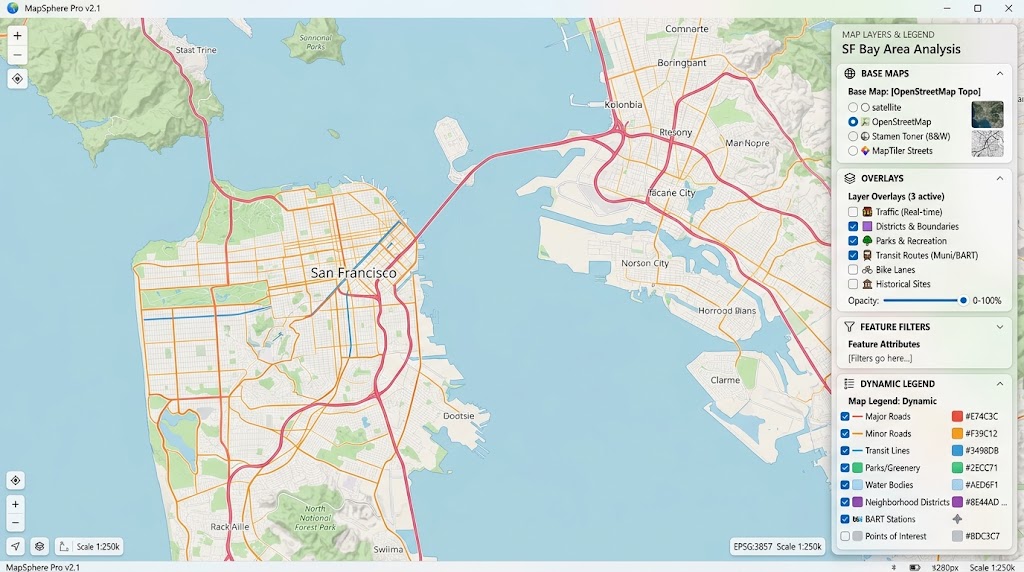
[Image 1: Web map interface showing custom Leaflet legend and collapsible layer switcher widget]
Alt Text: “Web browser screenshot highlighting a custom-built Leaflet layer switcher and dynamic legend control widget on an interactive map.”
Suggested caption: A reusable Leaflet control combines map-layer visibility, categorized overlays, and a dynamic legend in one collapsible interface.
6. Package and Distribute the Plugin as a Reusable Module
Once the control works in a sample map, organize the source code so other applications can install and reuse it.
A practical directory structure is:
leaflet-layer-legend-control/
├── src/
│   ├── LayerLegendControl.js
│   └── LayerLegendControl.css
├── examples/
│   └── index.html
├── tests/
│   └── LayerLegendControl.test.js
├── README.md
├── LICENSE
└── package.json
This structure separates source code, styles, demos, tests, and documentation. It also makes it easier to validate the plugin outside the original application.
6.1 Configure package.json
For a package using an ES module build pipeline, start with:
{
  "name": "leaflet-layer-legend-control",
  "version": "1.0.0",
  "description": "Reusable Leaflet layer switcher and dynamic legend control",
  "type": "module",
  "main": "./src/LayerLegendControl.js",
  "exports": {
    ".": "./src/LayerLegendControl.js",
    "./style.css": "./src/LayerLegendControl.css"
  },
  "peerDependencies": {
    "leaflet": "^1.9.4"
  }
}
The peerDependencies declaration indicates that the consuming application supplies Leaflet. This helps avoid bundling another copy of the mapping library into the plugin. The official Leaflet plugin authoring guide recommends keeping the code importable, avoiding unnecessary globals, and using a dedicated repository and clear documentation.
The example package exposes both the JavaScript entry point and a CSS subpath. After publishing, consumers using a compatible bundler can import the package and its stylesheet by name.
6.2 Document installation and use
The README should explain the supported Leaflet version, the required configuration schema, how to define overlays and base maps, and how legend labels and colours relate to layer styling.
Also document limitations: every configured entry should reference a valid Leaflet layer, each layer should appear only once in the control configuration, and legend symbols must be maintained alongside the actual layer styling.
Include a live demo showing base-map switching, overlay toggling, legend updates, collapse/expand interaction, and the control being removed and added again.
6.3 Test before publishing
At minimum, verify that:
-
The base-map radio buttons maintain mutually exclusive visibility.
-
Overlay checkboxes match actual map visibility.
-
Legends appear and disappear when overlays change.
-
Programmatic layer changes are reflected by the control.
-
The control works when initially collapsed.
-
Keyboard users can toggle the panel and operate inputs.
-
Removing and re-adding the control does not create duplicate event handling.
Test with the Leaflet version declared in peerDependencies. Leaflet 2.0 has undergone API and module-system changes, so supporting it should be treated as a separate compatibility
7. Scaling the Control for Enterprise Web GIS
The example is a functional starting point, but larger applications may require several extensions.
Layer grouping: Organize layers into categories such as Environment, Transport, Land Use, and Infrastructure. Collapsible groups prevent long layer lists from overwhelming users.
Richer legend symbols: Support line styles, point markers, opacity, numeric ranges, and externally generated WMS legends. Different geometry types often require different symbol representations.
Search and filtering: Add a text filter for applications with dozens or hundreds of layers. Consider filtering the configuration rather than repeatedly reconstructing the entire control on each keystroke.
Configuration validation: Validate that every entry includes a valid layer and that legend entries contain appropriate labels and colours. This makes errors easier to diagnose before the widget is rendered.
Performance: For large datasets, avoid redrawing unrelated legend sections whenever a single layer changes. Separate the layer-state update from the legend-section renderer and update only the affected entries when practical.
These improvements can be added incrementally while retaining the control’s core responsibilities: layer visibility, map-state synchronization, and legend interpretation.
8. SEO Best Practices and Internal Linking
Connect this tutorial with related front-end GIS development topics to create a useful learning path for readers.
| Suggested anchor text | Recommended destination |
|---|---|
| Building custom Leaflet control widgets for spatial filtering | /custom-leaflet-controls-spatial-filtering/ |
| Creating a Web GIS developer portfolio | /web-gis-developer-portfolio-guide/ |
| Styling GeoJSON layers in Leaflet | A related styling tutorial |
| Publishing interactive maps with modular JavaScript | A relevant deployment or JavaScript architecture guide |
Replace the suggested paths with the actual published URLs on your website.
Use the primary keyword naturally in the introduction, a relevant subheading, and the conclusion. Secondary keywords should appear where they accurately describe plugin architecture, custom controls, and reusable Web GIS components.
Include readable code blocks, meaningful subsection headings, and a clear screenshot demonstrating the completed widget. Avoid repeating the keyword unnaturally or describing the example as production-ready without testing it against the requirements of the target application.
Summary of Building Custom Leaflet Plugins
Building a custom Leaflet layer switcher and legend demonstrates how a small mapping interface can become a reusable plugin rather than a collection of application-specific controls.
By extending L.Control, defining layers through configuration objects, separating CSS from JavaScript, and responding to map events, you create an interface that remains synchronized with layer visibility. The same architecture can support more advanced functionality, including grouped overlays, spatial filtering, richer legends, and enterprise-specific interface styling.
The central design principle is to let the map’s actual state drive the interface. When a layer is enabled or disabled, both the switcher and legend should reflect that change. Combined with accessible controls, careful event cleanup, and clear package documentation, this approach provides a maintainable foundation for modular JavaScript web mapping widgets.
For further reading, consult the Leaflet API reference and the official Leaflet plugin authoring guide before extending the control or publishing it for wider use.